What has caused a reduction in the gender wage gap in the last two years? Among U.S. full-time workers women's wages are now a higher percentage of men's wages than ever before. Not reaching equality, mind you, and there certainly is no gender gap the other way round, but the gap has shrunk. The blog debate on this started with a post by Greg Mankiw in which he used this graph from the New York Times to show the behavior of the gender gap:
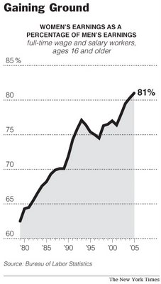
Graphs are fun to play with. Note the steepness of the curve which is intended to tell us how rapidly women's earnings are catching up with men's earnings. But if you look at the vertical axis more carefully, you will find that it has been stre-e-e-tched. Note where the vertical axis starts and where it ends.
That will help in making a steeply rising curve. What also helps is to use smaller units on the horizontal (essentially arbitrary-width) time axis than on the vertical percentage axis. It's easy to imagine making the same graph look much less steep with different choices. And do you still remember that the vertical axis ends before we get to equal earnings for full-time earners?
Are these choices intentional, you may wonder? Sometimes they are and sometimes they are not. But the important point to get is that the visual evidence from a graph is not necessarily a reliable reflection of the actual events.
Moving on from this graph to a different one. What caused the gender gap in wages to shrink? Sadly, the main reason is not one anybody would rejoice over: Men's wages have been recently falling at a higher rate than women's wages. Yes, Virginia, you can have equality at the bottom, too:
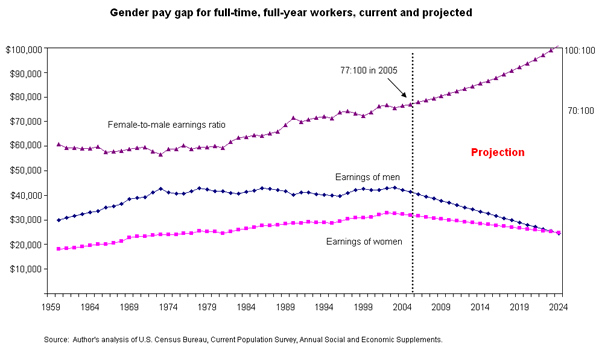
Here is the falling wages picture (left-click on it to make it bigger). Note that it includes an extrapolated segment into the future. Such segments are always dangerous to take seriously, and I caution you against doing so. Why? Because if we just extend any trendline which is not horizontal it will ultimately go out of the graph in one direction or the other, and usually the interpretation of that is nonsensical.
The graph uses a different vertical axis for the top curve (the wage gap) than for the other two earnings curves. The relevant axis for the top curve is on the right side, whereas the relevant axis for the two earnings curves is on the left side. That can be pretty confusing, too, as it's hard not to see the top curve somehow in relation to the other two.
Why would men's wages have fallen more rapidly? I think outsourcing is one important culprit here: the loss of fairly well-paying blue-collar jobs to other countries. The demise of the automobile towns and the mining towns and the steel-producing towns. Women are much more likely to be employed in the service industry and the jobs are slightly less outsourcable. Think of waitresses or hairdressers or dental hygienists.
Note also that these are full-time earners we are comparing here. Many more women work part-time in paid employment and part-time earnings are less per hour of work, not just in total numbers. If we included those earnings in the comparisons the gender gap would be a lot bigger.
As an aside, I hate the term "gender wars". Hate it with a red-hot hatred, because wanting fairness and equality between the sexes is poorly framed as a war-call, and because the very term "war" brings in connotations which are inappropriate for the proper understanding of the gender inequality in, say, much of Africa or Saudi Arabia, and because women, on the whole, don't see men as their enemies or regard feminism as a war. But some men do, as my earlier troll post shows.